
In the hierarchy of interior design, the sofa often acts as the protagonist and the rug as the stage, but the modern side table is the essential supporting character that holds the entire composition together. It serves as the critical bridge between a high-concept aesthetic and the unpolished reality of daily life.
For those drawn to the tapered legs and warm, organic wood tones of Mid-Century Modern (MCM) design, selecting a side table is an exercise in spatial problem-solving: how do we accommodate 2026 tech demands within a minimalist, 1950s-inspired footprint?
The Golden Ratio: Precision in Proportions
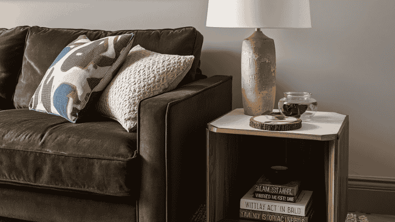
The most frequent oversight I see in residential projects is a height mismatch. A modern side table that sits awkwardly above or below the arm of your sofa creates a physical strain for the user and a visual “stutter” in the room’s horizon line.
The Designer’s Standard
Ideally, your side table should sit within two inches of your sofa’s arm height. If you’ve invested in a low-slung, contemporary Italian sectional (typically 18″–22″ at the arm), a towering 26-inch pedestal table will look like a scaling error. Aim for a tabletop that feels like a natural extension of your reach.
Tapered Legs and Visual Breathability
The genius of the MCM silhouette lies in “the lift.” By utilizing splayed, tapered legs, these tables expose the floorboards beneath them. This is a vital design hack for tight urban apartments; when the eye can track the floor all the way to the baseboard, the brain perceives the room as expansive rather than cluttered.
What Most Interior Guides Get Wrong
Standard furniture listicles often focus purely on aesthetics, but they ignore the “Vibration and Stability” factor. A lightweight, budget-grade modern side table might look great on Instagram, but if it wobbles every time you set down a coffee mug or type on a laptop, it has failed its primary architectural purpose.
Most guides also fail to mention Surface Friction. Mid-century designs often feature slick lacquer or oil finishes. If your floor isn’t perfectly level—common in older US rentals—these tables will “walk” or tilt. We always recommend looking for pieces with adjustable leveling glides hidden within the brass ferrule of the leg. It’s the difference between a table that feels like an heirloom and one that feels like a temporary prop.
Case Study 1: The “C-Table” Spatial Pivot
The Client: A creative professional living in a 450 sq. ft. studio. The Dilemma: The classic “sofa-desk-bed” sprawl. Using a standard coffee table for laptop work led to a hunched posture and a permanent obstacle in the walking path. The Solution: We integrated a walnut modern side table with a cantilevered C-shaped base.
The Design Logic: The base slides seamlessly under the sofa frame, bringing the surface directly over the lap. This eliminated the need for a bulky desk, reclaiming 12 square feet of floor space. At night, it pivots back to a minimalist accent piece, holding a single negroni rather than a 13-inch MacBook.
Selection Logic: Utility vs. Pure Form
When specifying an accent piece, I look at “surface area reality.” While a round table offers iconic curves, a square or rectangular table provides roughly 20% more usable surface area within the same footprint.
- Solid Walnut & Teak: Heritage investments. Unlike mass-market veneers, solid wood can be refinished over decades, aging with a patina that cheaper alternatives can’t replicate.
- Stone-Top Hybrids: For clients who refuse to use coasters, I suggest MCM silhouettes with sintered stone or honed marble tops. You get the vintage “look” without the anxiety of permanent water rings.
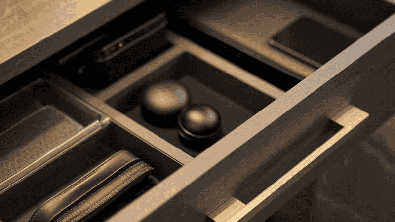
- Hidden Storage: A single, well-crafted drawer is a luxury of convenience. It swallows the “visual noise” of remotes and charging cables.
The Designer’s Edit: High-Ticket Conversion Guide
Best Overall Setup: The Solid Walnut Drawer Table
- Target User: The discerning homeowner who values tactile quality and long-term durability.
- Why it wins: A 20″ x 20″ square walnut table with a soft-close drawer offers the perfect “visual weight.” It’s substantial enough to anchor a heavy sectional but refined enough to stand solo in a reading corner.
Best for Small Spaces: The Scandi-MCM Nesting Set
- Target User: Renters and studio dwellers who host guests but need to keep walkways clear daily.
- Why it wins: Flexibility is your greatest asset. These allow for a compact daily footprint that “blossoms” into three separate surfaces when hosting. It’s the ultimate space-optimization tool.
Best Premium Option: The Sintered Stone & Brass Pedestal
- Target User: The design enthusiast who wants a “no-maintenance” statement piece that doubles as a work of art.
- Why it wins: This setup avoids the fragility of wood veneer. It handles heat, moisture, and heavy use while the weighted brass base provides unparalleled stability for WFH setups.
Case Study 2: The Bedside Tech Integration
The Client: A tech executive who struggled with “nightstand clutter” in a narrow bedroom. The Problem: Traditional boxy nightstands made the room feel claustrophobic and became a graveyard for tangled white cables. The Solution: We swapped the bulky units for slim-profile modern side tables with an open lower shelf.
The Design Logic: By removing the “visual block” of a cabinet door, the room felt two feet wider. We routed a discreet cable management channel down the back of one tapered leg, keeping chargers accessible but invisible. The result was a clean, “Pinterest-ready” surface that actually functioned in a high-tech reality.
Professional Pitfalls to Avoid
- The “Leg Forest”: Avoid pairing a four-legged side table with a sofa that also has thin, exposed legs. If your sofa has legs, try a pedestal or C-base table to vary the geometry.
- Ignoring the “Drink Test”: If you have to lean forward or stretch to reach your drink, the table is poorly placed or incorrectly scaled.
- The Scale Mismatch: Never put a dainty accent table next to a massive, overstuffed recliner. Match the “visual volume” of your pieces.
FAQ: Styling and Longevity
How do I protect my modern side table from heat and moisture? Mid-century finishes are notoriously sensitive. Beyond coasters, I recommend a high-quality furniture wax once a year to provide a thin protective barrier.
Round or square for a high-traffic hallway? Always round. Soft edges prevent “snags” on clothing and are much more forgiving for toddlers and shins in narrow transition zones.
Can I mix different wood species in one room? Absolutely, provided the undertones match. A warm “honey” oak and a deep walnut work together because they both share a warm base. Avoid mixing cool-grey “weathered” woods with vibrant MCM teak.
What is the ideal clearance around a side table? Leave at least 2 inches between the table and the sofa arm to avoid a cramped look, and ensure there is a 15-inch clear path for walking if the table is near a doorway.
Are drawer-less side tables practical for WFH? Only if you use external cable management. Without a drawer to hide your hub and wires, a modern side table can quickly look like a cluttered desk rather than a piece of decor.