
Your living room isn’t fundamentally flawed; it’s likely just suffering from a lack of “visual breath.” In high-density urban living—from Manhattan studios to converted bungalows—the instinct is often to maximize utility by filling every corner. However, sophisticated design dictates that in a tight footprint, negative space is as much a “piece” of furniture as the sofa itself.
The objective isn’t merely to fit your life into the room, but to curate a small living room design that honors spatial flow and architectural proportions.
The “Leggy” Logic: Managing Visual Volume
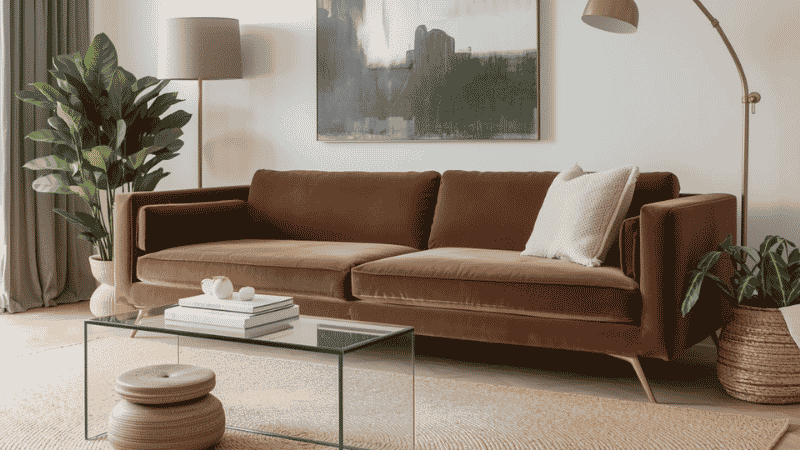
In design, we look at the “footprint” versus the “volume.” A heavy, skirted sofa that sits flush to the floor acts as a visual anchor—but in a small room, it’s an anchor that drags the ceiling down with it. To reclaim the floor, you must prioritize pieces with tapered legs.
By exposing the floorboards beneath your seating, you allow the eye to travel through the piece rather than stopping at its base. This creates a continuous sightline that mentally expands the room’s boundaries. This principle is essential when browsing small space living furniture to ensure your selections don’t overwhelm the room’s capacity.
Why Visual Transparency Matters
When you can see the corners of the room and the floor extending to the baseboards, your brain registers the total square footage. Solid, “blocky” furniture creates mental dead zones that make a 200-square-foot room feel like 100.
Spatial Flow: Moving Beyond the “Perimeter Push”
The most common amateur mistake is the “waiting room” layout—pushing every chair and sofa flush against the walls. This actually highlights the room’s limited dimensions. Instead, we look for ways to float the furniture, even if only by a few inches.
A “breathable” layout requires a dedicated clearance zone. For a living room to remain functional and not just a gallery, you need at least 18 inches between your coffee table and sofa, and a primary walkway of at least 30 to 36 inches.
Case Example 1: The “Railroad” Layout Strategy
In long, narrow townhome parlors, the “bowling alley” effect is a constant struggle.
- The Strategy: Rather than lining the long wall with a massive sectional, we utilized a “Zoning” approach. We placed a low-slung loveseat at the two-thirds mark of the room, backed by a slim console table.
- The Result: This created a distinct foyer/walkway behind the seating, while two “ghost” (acrylic) armchairs provided seating without adding any visual weight. The room suddenly felt like two intentional spaces rather than one cramped hallway.
What Most Interior Guides Get Wrong
Most generic advice tells you to “buy small furniture for small rooms.” This is a recipe for a dollhouse aesthetic that feels cluttered rather than curated.
- The Scaling Error: Filling a room with ten small items creates “visual noise.” It is far better to have one slightly oversized, high-quality sofa and nothing else, than a cramped loveseat, two tiny stools, and three side tables.
- The Neutral Myth: You don’t have to paint everything white. A dark, moody color on the walls can actually make boundaries disappear, creating an infinite feel—provided your furniture remains low-profile.
- The “Storage” Trap: Adding more “storage units” often just adds more bulk. True design optimization looks at “editing” what you own rather than finding new ways to hide it.
The Hierarchy of Visual Weight
Designers often talk about “visual weight”—the perceived heaviness of an object. A dark, velvet chesterfield has immense weight; a glass-topped C-table has almost none. Balancing these is the key to a room that feels “expensive” but airy.
Featured Recommendations for High-Ticket Layouts
Best Overall Setup: The “Elevated” Anchor
- The Choice: A Mid-Century Modern Sofa with 8-inch tapered oak legs.
- Target User: The homeowner who wants a permanent, “grown-up” look that balances comfort with sophisticated architectural lines.
- Why it wins: It provides a full-sized seating experience while maintaining the floor-level transparency needed to keep the room feeling open.
Best for Small Spaces: The “Vanishing” Surface
- The Choice: A High-Grade Tempered Glass or Polished Acrylic Coffee Table.
- Target User: Apartment dwellers and studio renters who need a functional surface that doesn’t visually occupy the center of the room.
- Why it wins: It serves the functional need (holding drinks, books) while being effectively “invisible” to the eye.
Best Premium Option: The Modular Performance Sectional
- The Choice: A low-profile, modular seating system with a reversible chaise.
- Target User: Remote workers and families who need versatility.
- Why it wins: High-ticket modulars offer the ability to “break” the sofa apart if the layout feels too heavy, allowing you to pivot from a sectional to a sofa-and-ottoman setup in minutes.
Real-Life Case Example 2: The Multi-Hyphenate Studio
We recently consulted on a 450-square-foot WFH hybrid where the living room also served as the primary office and dining area.
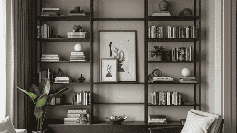
- The Strategy: We employed Vertical Proportioning. By installing a custom floor-to-ceiling shelving unit, we moved the clutter off the floor and drew the eye toward the 9-foot ceilings.
- The Furniture: We swapped a traditional desk for a “floating” wall-mounted secretary desk. By grounding the seating area with an oversized 9×12 rug, we tricked the eye into perceiving the seating area as a grand, singular zone rather than a cramped corner of a bedroom. For more on this, see our guide on maximizing vertical storage.
The Designer’s “Don’ts”: Correcting the Clutter
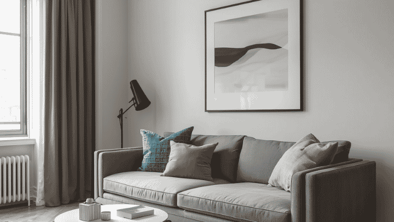
- Stop “Micro-Rug” Shopping: A 5×7 rug in a living room is a death sentence for design. It creates a “floating island” effect. Go as large as the room allows; when the furniture legs sit entirely on the rug, the space feels unified and expansive.
- Beware the “Set”: Avoid the “Sofa-Loveseat-Chair” matching set. It’s a retail trick that leads to bulky, repetitive proportions. Instead, mix a structured sofa with a lighter, airy accent chair to create contrast.
- The “One Big Thing” Rule: Counterintuitively, one large, statement piece of art or a single oversized lamp is better than five small ones. “Small things” create “small energy.”
Designer FAQ: Navigating Small Living Room Design Ideas
Q: Is a sectional a “never” for small rooms? Not at all, but it must be a “floating” sectional with a low back. If the back of the sofa is higher than 32 inches, it acts as a wall. Keep the profile low to keep the sightlines open.
Q: How do I choose a color palette that doesn’t feel “sterile”? Use the 60-30-10 rule. 60% neutral (walls/sofa), 30% a secondary texture (wood/stone), and 10% a bold, sophisticated accent like a deep terracotta or navy. This provides depth without the chaos of a “rainbow” palette.
Q: What about the TV? Mount it, always. Use a low-profile, “Art-mode” television if the budget allows. By removing the bulky media stand, you reclaim roughly 6 to 10 square feet of floor space—vital territory in a small room.
Q: How do I handle lighting without taking up floor space? Avoid bulky floor lamps in high-traffic corners. Instead, use “swing-arm” wall sconces. They provide targeted task lighting for reading but leave the floor entirely clear, maintaining that crucial sense of openness.
Final Checklist for a Spacious Layout
- [ ] Furniture has visible legs to show the floor.
- [ ] Walkways are at least 30 inches wide.
- [ ] The rug is large enough to tuck under all primary seating.
- [ ] Surfaces (coffee tables) are glass or metallic to reflect light.
- [ ] At least one “vertical” element draws the eye toward the ceiling.