There is a specific claustrophobia that sets in when a home feels like a warehouse for belongings rather than a sanctuary for living. In urban markets where the “square footage tax” is a reality, the challenge of a small space isn’t simply about cramming a life into a box—it’s about utilizing “visual volume” to expand the perceived boundaries of that box.
As designers, we view a constrained footprint not as a limitation, but as an exercise in structural editing. Optimization is the art of balancing functional density with psychological breathing room. To master your floor plan, you must move beyond generic hacks and embrace a framework of intentional spatial flow and high-utility furniture selection.
The Zone Method: Engineering the Open-Plan Studio
The most common failure in small-space living is treating the room as a singular, multi-purpose blur. When your bed is three feet from your “desk,” which is two feet from your “kitchen,” the brain never fully transitions from labor to rest.
Defining “Micro-Zones”
Visual separation doesn’t require a permit or a drywall crew. You can define zones through:
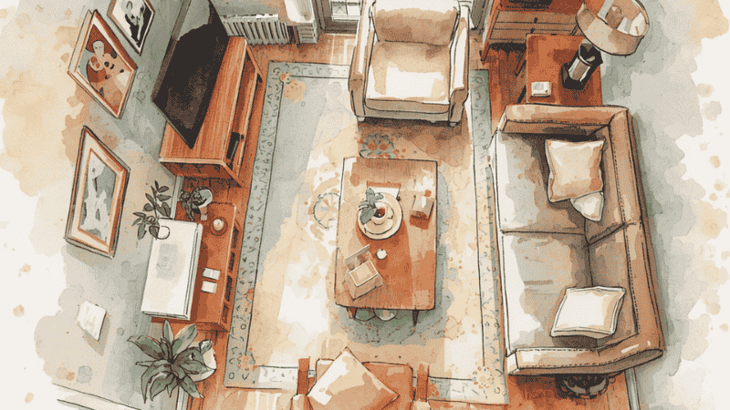
- Rug Anchoring: A rug acts as a psychological boundary. Use a large-scale weave to “ground” the living area, signaling where the hardwood thoroughfare ends and the “lounge” begins.
- The Lighting Pool: A pendant dropped over a bistro table and a dedicated task lamp at a desk create distinct pools of light. This allows you to “turn off” the office zone at 5:00 PM by simply killing the light, shifting the room’s energy instantly.
The 24-Inch Circulation Rule
Optimization fails if you cannot move through the space naturally. In any small space layout, you must maintain a minimum of 24 to 30 inches for primary walkways. If a “space-saving” modular sectional forces you to sidle past the TV stand like a spy in a corridor, the piece is too large for the room’s scale.
What Most Interior Guides Get Wrong
Standard furniture blogs often advocate for “miniature” furniture, but this is a fundamental design error. Buying a tiny rug and a tiny sofa actually emphasizes a room’s smallness, making it look like a dollhouse. Professionals know that one or two full-scale pieces—like a large rug that tucks under all the furniture—actually unify the space and make it feel grander.
Furthermore, guides often ignore Visual Weight. A solid black wooden sideboard has the same physical dimensions as a fluted glass one, but the glass version feels “lighter” because it doesn’t stop the eye. In a tight layout, you aren’t just managing inches; you are managing light and transparency.
[Internal Link: Learn how to choose the right Modern Sideboard for high-utility storage without the bulk.]
The “Legs vs. Base” Debate: Why Elevation Matters
In a cramped room, the most valuable real estate is the floor you can actually see. This is the concept of Visual Breathability.
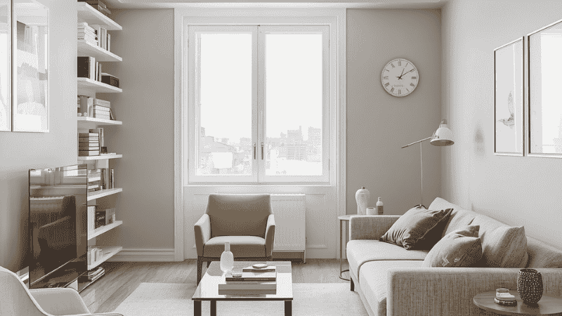
- The Case for Legs: I almost always specify Mid-Century Modern or Scandinavian pieces with tapered legs for tight quarters. By elevating the bulk of a sideboard or sofa, you allow light to pass underneath and the eye to track the floor line all the way to the baseboard.
- The Heavy Base Trap: A sofa that sits flush to the floor (a “plinth” base) acts as a visual blockade. It anchors the room too heavily, making the ceiling feel lower and the walls feel like they are closing in.
Case Study 1: The “400 Sq. Ft. Transformer”
The Scenario: A tech professional in a San Francisco studio who needed a home office, a guest “room,” and a fitness area. The Intervention: We ignored the “small furniture” myth. Instead of several cluttered, tiny pieces, we used one large Integrated Storage Bed (a Murphy hybrid) and a Wall-Mounted Floating Desk. The Result: By folding the bed into the wall, the “bedroom” became a 60-square-foot clear zone for yoga and morning workouts. The floating desk eliminated the visual noise of four extra legs, keeping the floor line clean.
High-Ticket Selection: The Designer’s Edit
Best Overall Setup: The Modular Sectional
- Who it’s for: The long-term urbanite who needs a piece that evolves.
- The Logic: Forget static loveseats. A modular system allows you to reconfigure the “L” shape to fit awkward alcoves. It’s an investment that grows with you, moving from a studio to a two-bedroom home without becoming obsolete.
Best for Small Spaces: The C-Table & Nesting Set
- Who it’s for: Renters in micro-apartments where every square inch counts.
- The Logic: Traditional coffee tables are footprint-hogs. A C-table slides its base under your sofa, providing a surface with a zero-inch floor footprint. Nesting tables “blossom” only when guests arrive, reclaiming central real estate daily.
Best Premium Option: The Integrated Murphy-Library System
- Who it’s for: Homeowners looking to turn a studio or guest room into a high-end, dual-purpose suite.
- The Logic: This isn’t your grandfather’s Murphy bed. Modern premium systems integrate seamless shelving and lighting. It is the ultimate luxury for those who refuse to sacrifice a “real” bed for a sofa but need the floor space for daily life.
Case Study 2: The “Broken-Plan” Railroad Apartment
The Scenario: A narrow living area in Brooklyn where a rectangular dining table physically blocked the path to the bathroom. The Intervention: We swapped the blocky table for a Round Pedestal Table and used Acrylic (Ghost) Chairs. The Logic: The pedestal base allowed chairs to be tucked in completely. The acrylic material provided seating without adding visual weight—the chairs are physically present but visually “invisible,” maintaining a clean line of sight.
[Internal Link: Find the perfect Modern Side Table to complement your small-space lounge.]
Professional Pitfalls to Avoid
- Convertible Fatigue: If it takes more than 30 seconds to convert your desk into a dining table, you won’t do it. Avoid over-engineered furniture.
- The Open-Shelving Trap: Open shelving is a Pinterest dream but a real-life dust and clutter magnet. In a small space, closed storage is your best friend for maintaining “Visual Quiet.”
- Ignoring Vertical Real Estate: Most people stop decorating at eye level. Taking shelving or curtains all the way to the ceiling draws the eye upward, emphasizing height over a narrow footprint.
FAQ: Navigating the Micro-Unit
Does a dark wall color make a small room look smaller? Not necessarily. While light colors are “safe,” receding dark colors like navy or charcoal can add incredible depth. By making the corners of a room “disappear,” you create a cozy, expansive cocoon effect.
One large rug or several small ones? Always one large rug. Multiple small rugs break up the floor and make the room look like a patchwork quilt. A large rug that reaches within 6 inches of the walls unifies the space.
How do I handle “Dead Corners”? Negative space is a design element—don’t feel the need to fill every inch. If you must use it, go vertical: a tall, slender floor lamp adds interest without consuming floor area.
Can I have a “Home Office” in a bedroom? Yes, but look for a “cloffice” (closet-office) or a desk that doubles as a vanity. The key is to hide the “work” (monitors and cables) at night so your sleeping zone remains sacred.
How do I choose a dining table for a narrow room? A round pedestal table is almost always the winner. It lacks sharp corners that interrupt movement and allows for flexible seating counts.